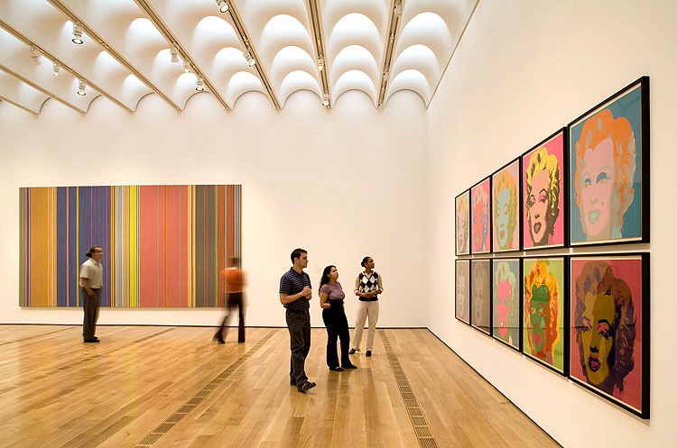
As you may know by now, I consciously painted my entire home gallery white 5 years ago. I am a huge fan of art and frequent the High Museum of Art, MODA, and various art galleries and districts in Atlanta. When I’m traveling, I try to make it to as many art galleries as possible too.

It should be no surprise that I wanted gallery white walls throughout my home. It lends itself to all kinds of art and is a blank canvas. This was important to me because I travel and like to pick up pieces along the way. Having gallery white walls ensures that no matter what I purchase, it’s being set against a clean canvas.
You’re probably wondering how do I plan to keep my white walls clean with a 14 month old boy babe. Well, when I painted my home, Avery was not even in the picture. But I always wanted a family and chose a paint from Home Depot that allows you to easily wipe the walls clean with minimal soap and water. My white walls are kid tested and approved.
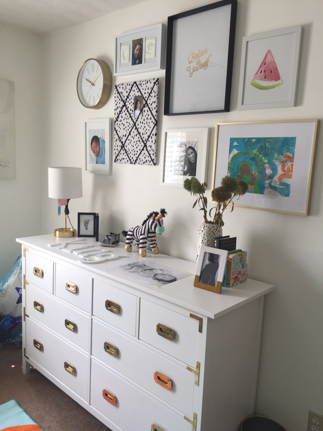
This is a gallery wall that I designed in Avery’s room. All of the images are equal distant apart, however the varying heights do not share a common baseline. In this example, the images share a common width and exceed the width of the dresser by equal amounts, to maintain balance. The easiest way to test this out is to place all of your images on the floor and rearrange them like a game of Tetris until your satisfied with the layout: distance, proportion, and balance. Snap a photo so that you won’t forget your layout. Refer to this when hanging your images.
Story on Avery’s Nursery and A DIY hack to make this dresser will be released soon.
I love huge images. Maybe it’s the graphic designer in me or even the photographer in me but I like to go big or go home. With that being said, I keep in mind my canvas size and chose sizes that maintain balance, scale and proportion. In other words, if you don’t have a lot of space, chose images that do not crowd your space and keep a sense of balance.
Something that I learned in 4 years of design school is that you always want breathing room between art. It gives the audience the opportunity to focus on your focal point, relax their eyes, and then focus again. In both of my collages, you will notice equal distant of white space and there is a sense of balance. In the portraits in my hallway, all photos sit on the same baseline or top line. Choose whatever amount of white space you like and be consistent. I went with 3 inches in the below example. Feel free to choose more. Also, your grid does not have to be the same as mine. It can be more sporadic like the way it is in Avery’s room.
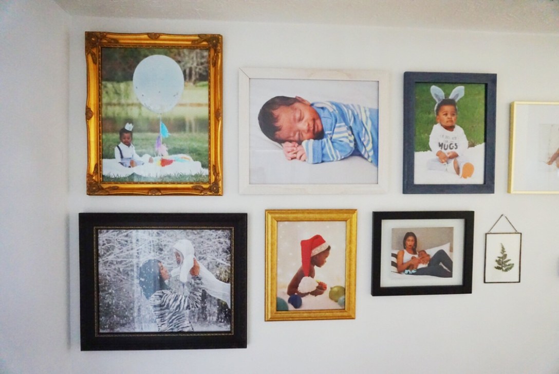
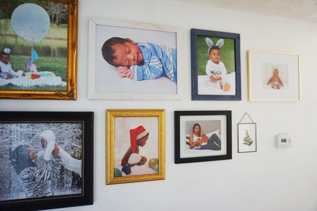
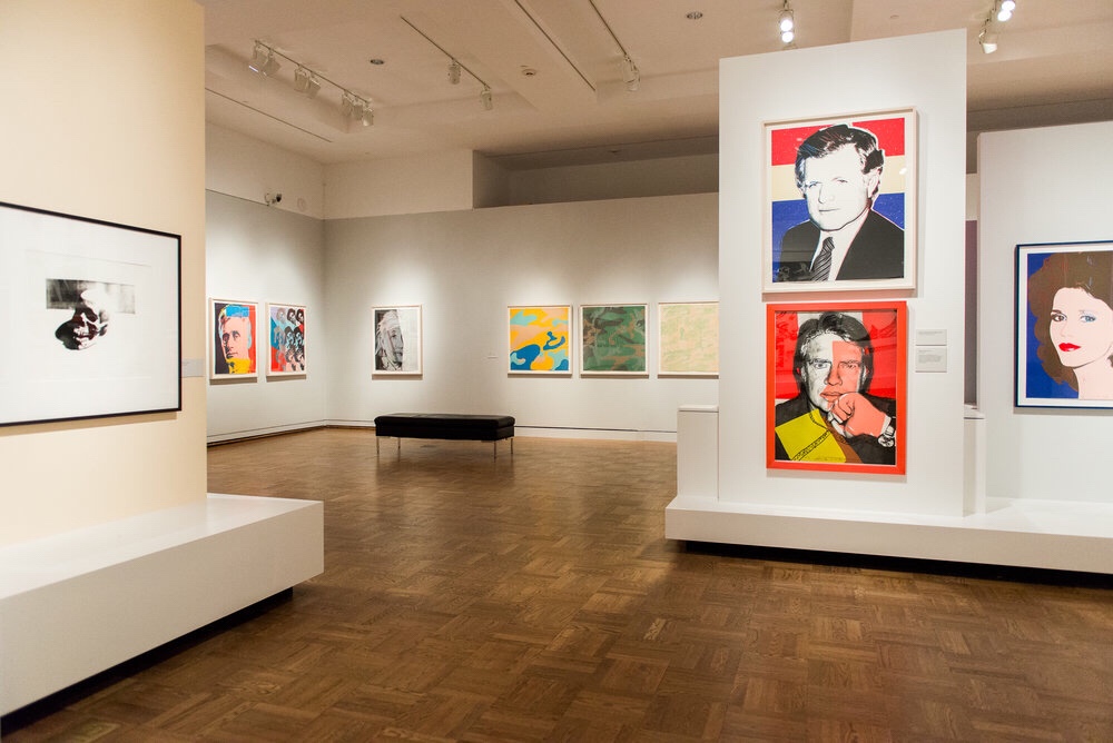
You’re probably thinking but you have 8 pieces of art on this wall. That doesn’t sound like breathing room to me. My entire hallway is white and empty. Having this one collage of photos works because it is surrounded by space. Think about how artists display their work in the High Museum, the Guggenheim, MOMA, the Louve or whatever museum is in your city. The collection is often displayed in a cluster or collage, surrounded by space. You can take inspiration from this and do your version in your home as well.
I chose the frames first. You don’t have do it is this way, you can chose your favorite images first and let that inspire and guide you to frame sizes and colors. Anytime I visited an art store, I would purchase whatever frame was my favorite. Regardless of color or size. Once I got a pretty good collection, I pulled up my favorite photographs of Avery and decided which photograph would accommodate each frame.
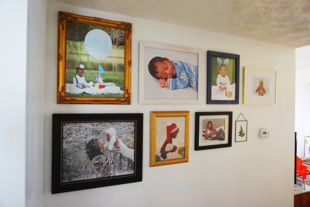
You want the photographs to compliment the frame. If you are using multiple frames that do not match in color, when you are looking at your photographs and trying to figure out which ones belong to which frame, consider photographs that compliment that frame. I’ve provided a color wheel below for those of you that are less familiar with complimentary colors. This color wheel comes from Cornell University. They have implemented the use of complimentary colors in their flower garden by pairing red flowers next to green, etc. to intensify each flower. The red flowers will appear brighter against green florals.
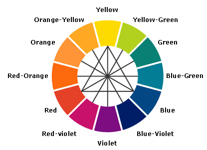
Complimentary colors are colors that are directly opposite of each other on the color spectrum. In the example above, I talk about how red and green are complimentary colors. Using complimentary colors is one of an artists biggest secrets. This creates the strongest contrast and harmony. But you don’t have to use complimentary colors for your pairings to look super awesome. Once you understand the rules, you can break them.
For printing, I like to go with print shops that have high quality printers. That means I stay away from the Staples and Office Depots of the world. They also don’t print a lot of the large format sizes that I usually need. They are disappearing like hot cakes but if you have a Wolf Camera in your area or a trusted small local print shop in your area, I would go with that.
If you’re into online ordering, I recommend RitzPix. I believe they bought out Wolf Camera and they usually have promos on prints. I’ve tried Shutterfly a few times and I always notice deficiencies with the actual prints. But I’m also looking for things that only a graphic designer or photographer would probably notice. Printing with Shutterfly is definitely a more cost effective option.
For framing, I hate to admit this but often times I’ll just buy the sawtooth hanger that you either nail in or screw in. This is not the best way to hang a picture but it gets you really close to perfection. Just about all of my photos are hung this way in my home. The best way is to hang your pictures is with a picture hanging wire. It gives you more forgiveness and gets you the most precise leveling when using your wall level tool. There are so many video tutorials on how to do both of these that I will let you explore.
That’s it for now but please feel free to ask any questions below. Even if it’s just helping finding the right tutorials. I’m here for you! Now go build your gallery wall like a pro with confidence and send us some pix when you’re done!
—
SHOP THE LOOK
RitzPix usually runs promotions for your photo printing needs.
I don’t recommend Shutterfly but they are probably one of the more cost effective places you can print. And if you download their app, ALL 4×6 prints are FREE! You do have to pay for the shipping so make sure you are getting more than $6 worth or prints out of them to justify this spend.
Hobby Lobby has a daily 40% off 1 item coupon that you can google and pull up on your phone. The cashier will scan it at check out. They usually have 50% off frames daily, however if you see something else you want, be sure to use this coupon! Remember, it’s only for 1 item so be sure to use it on the most expensive item in your shopping cart.
Michaels usually has at least 40% sales on frames daily. Check with your local Michaels for the latest.
